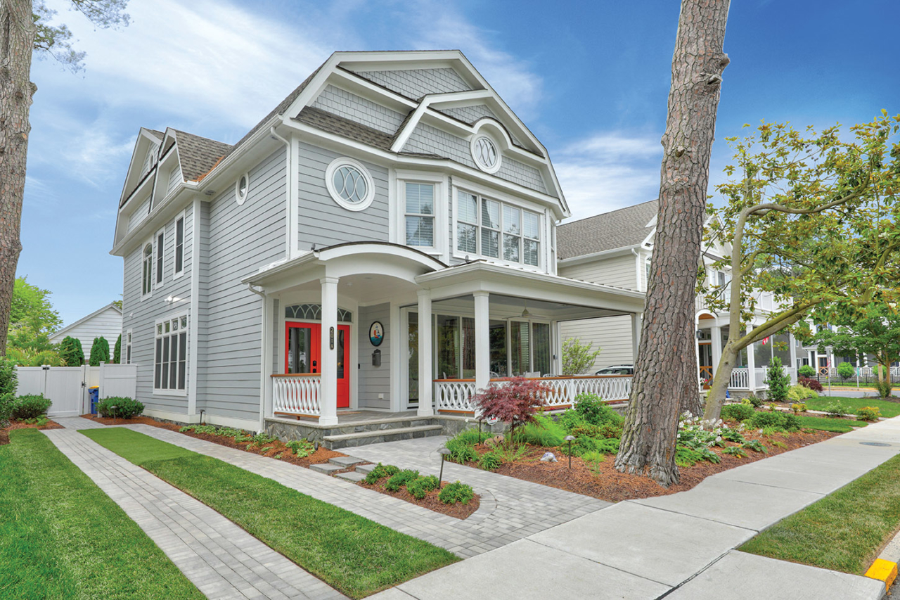
A Rehoboth Beach home is designed by Lucille Cavan to take the owners back to one of their favorite spots to vacation — St. John Island.
Written by Kristen Hampshire|Photography by Krista Valliant
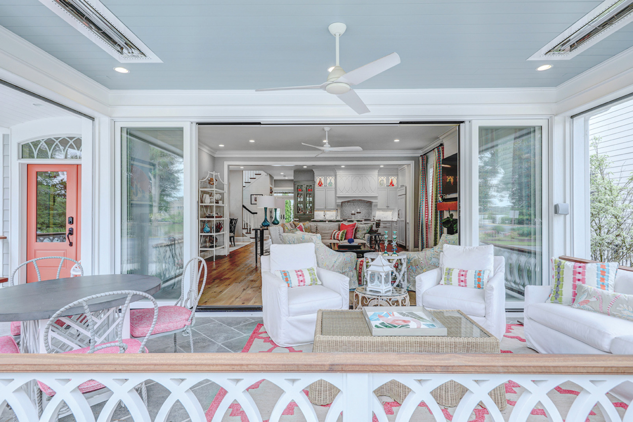
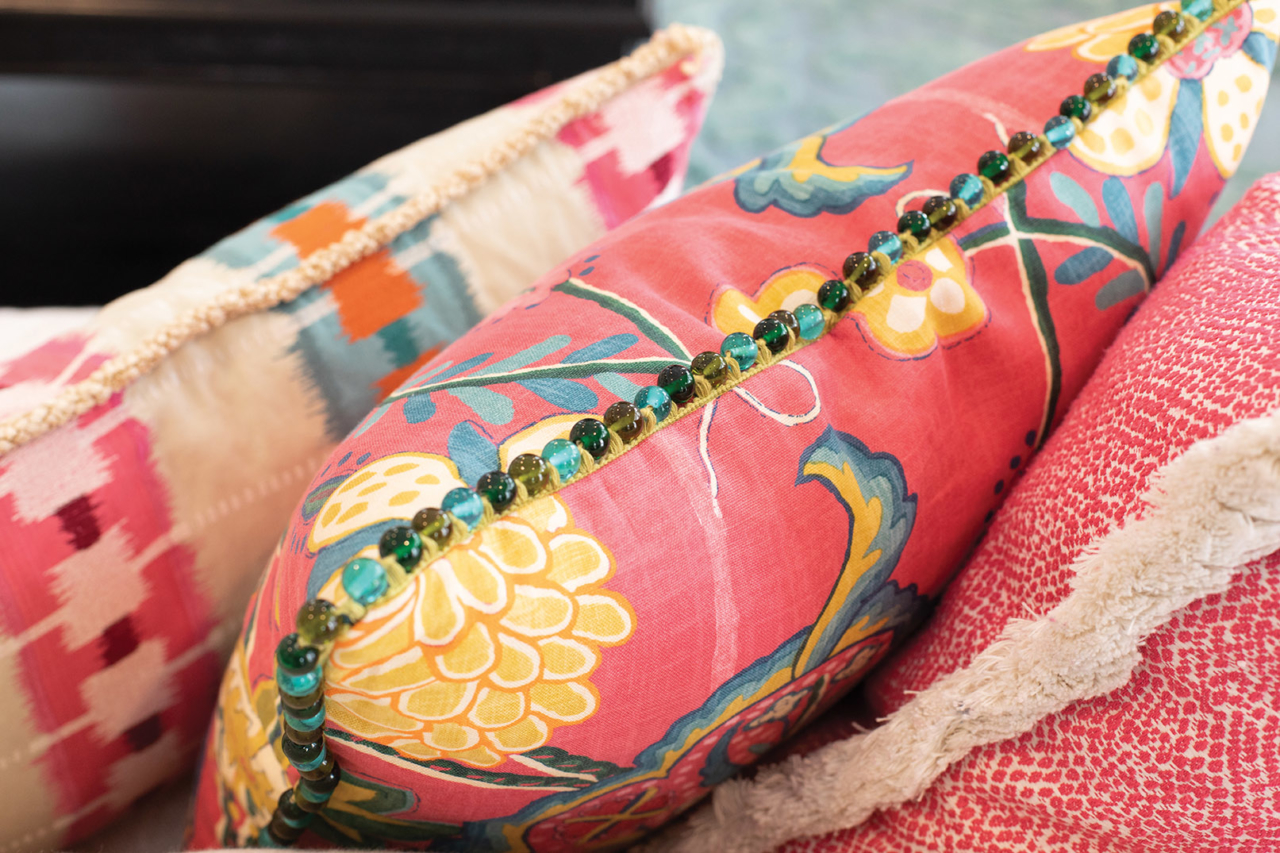
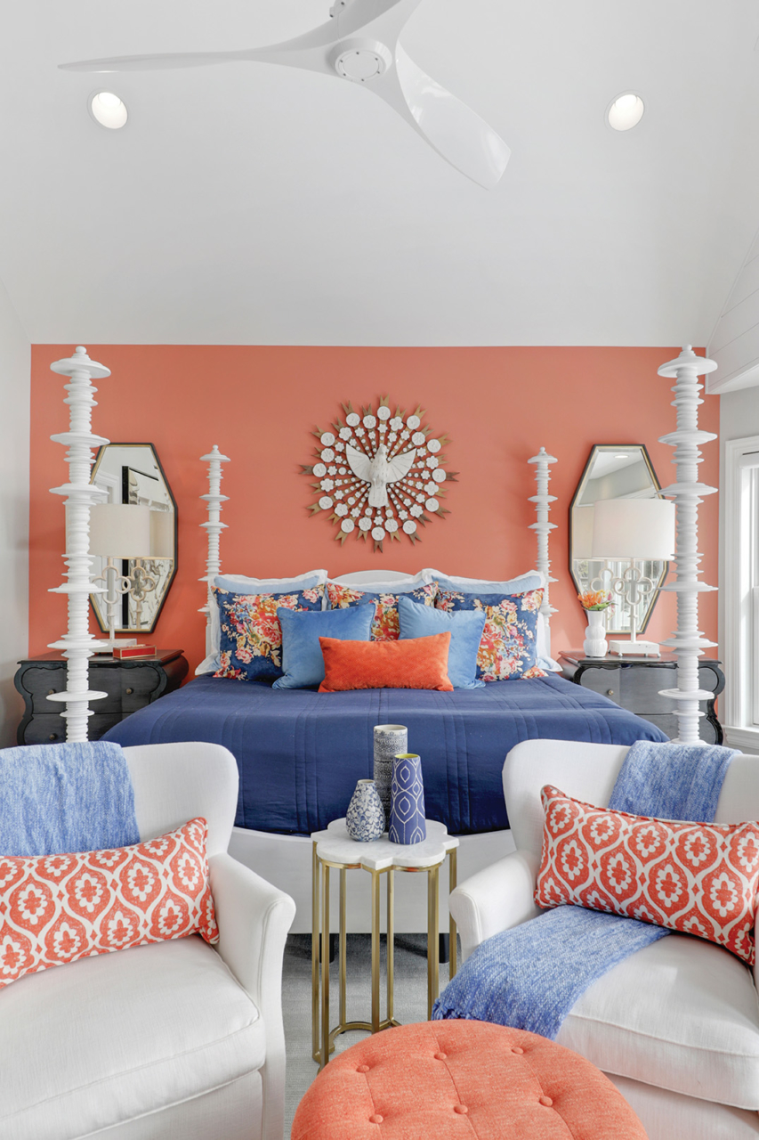
The Caribbean Island of St. John set the tone and triggered inspiration for what evolved into a whole- house remodel in Rehoboth Beach. And from there, a single pillow bearing the island’s map was a pivotal piece for selecting colors, patterns, textures, surfaces and accessories.
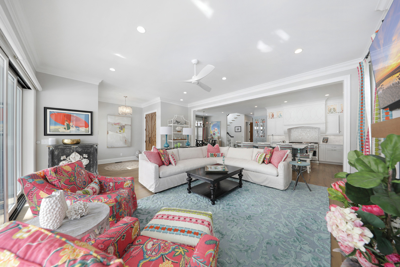
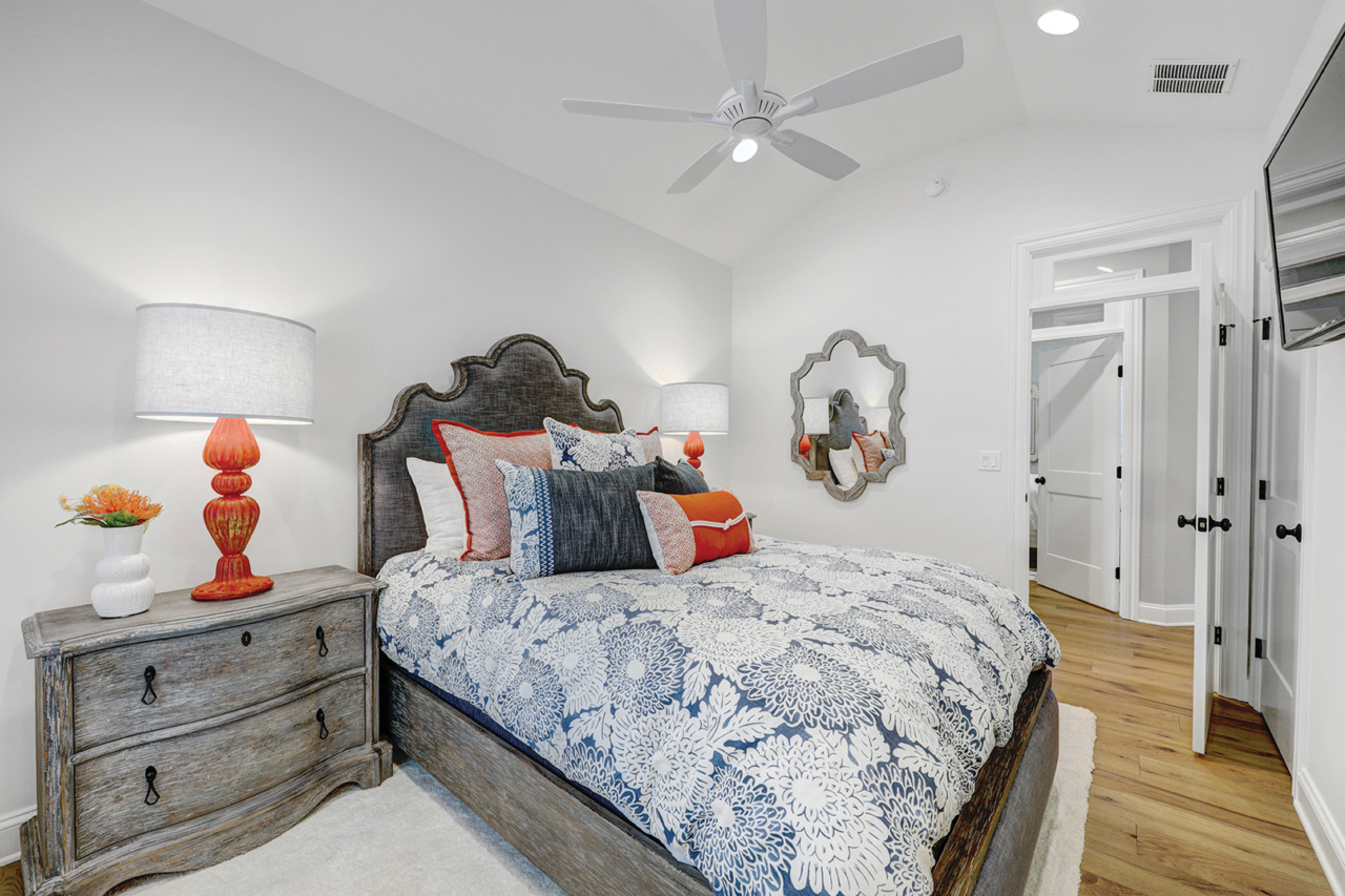
Playful yet sophisticated, whimsical yet grounded, the design is saturated in the smart use of color.
“There is psychology to color,” points out Lucille Cavan, principal and designer at ReIMAGINATION Design LLC, a firm she started five years ago after an executive career in financial services. After studying design, she followed her passion and opened the practice.
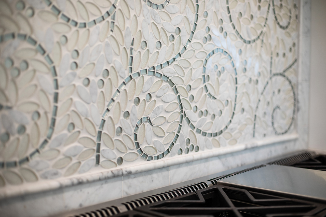
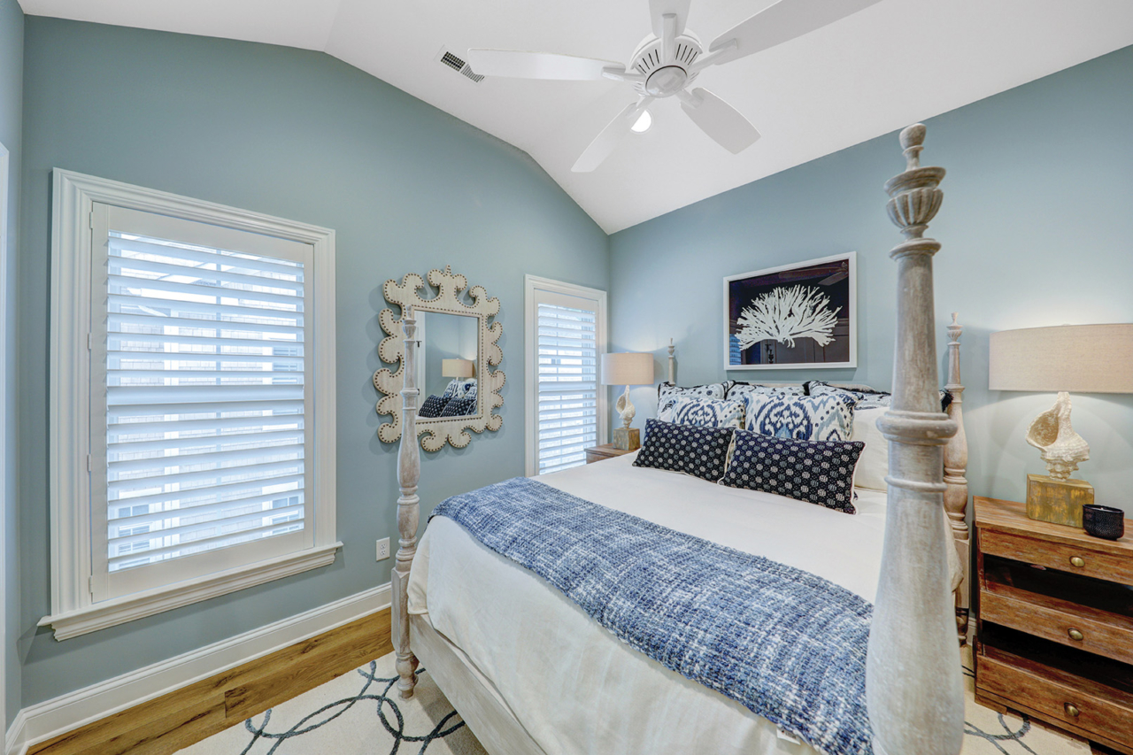
The homeowner’s goal was to infuse coastal colors throughout the home. “The owner loves fabrics, loves color and loves texture, so that made the project really fun,” Cavan says, relating how hues flow from room to room and are balanced with neutrals including ivory, gray and black. “Even the wood finish we selected for the table looked like sand,” she adds of the theme.
What follows are some ways Cavan carried out the Caribbean color scheme and how you can incorporate fresh shades into your home.
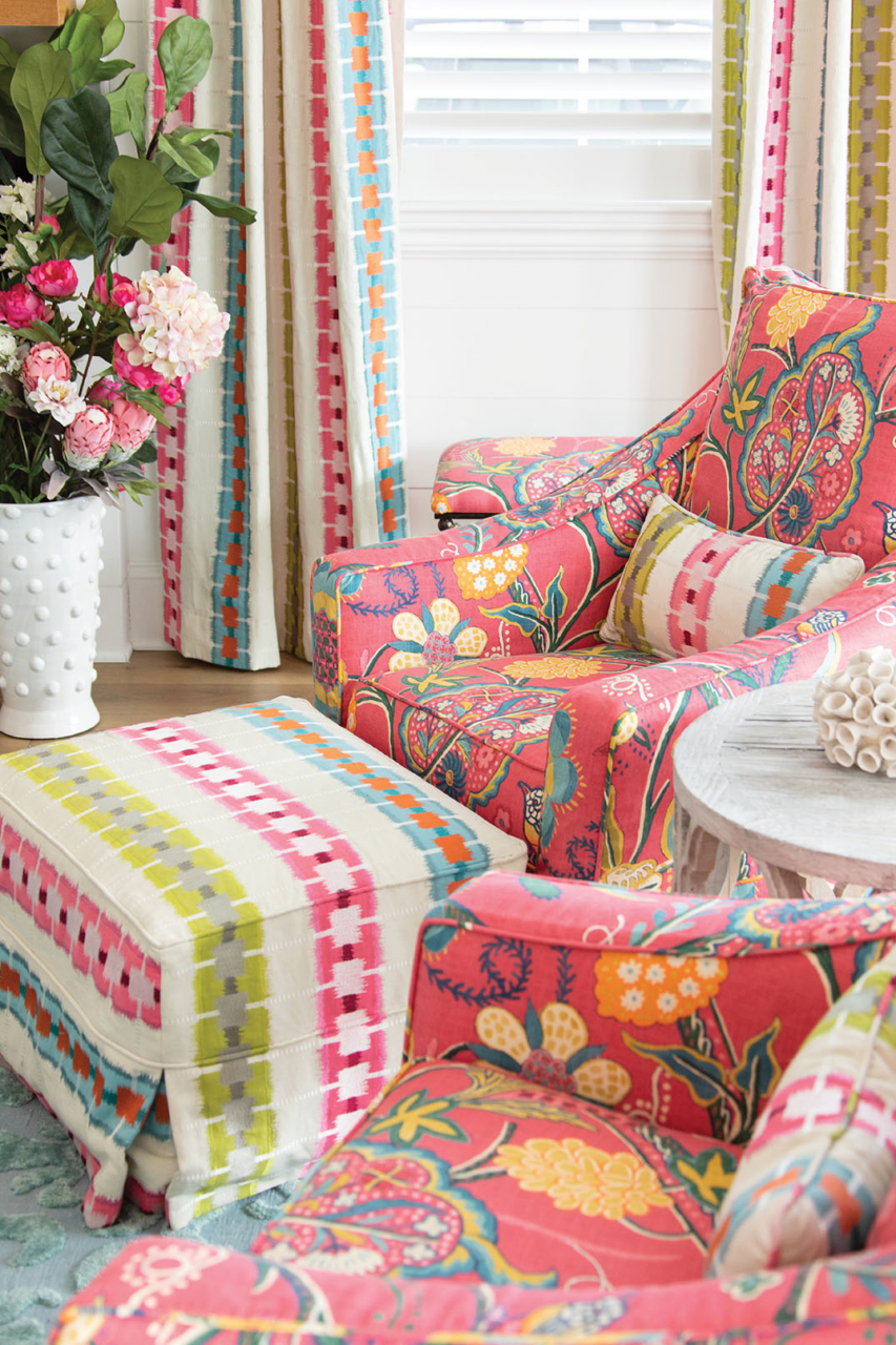
Start with one piece:For this home, that “one” was the pillow of a map — and a secondary inspo swatch was a new fabric introduction by Thibault Wallpaper & Fabric that Cavan incorporated as covers for two feature chairs. “The pattern went so nicely with the existing drapery, and we found pillows with piping that made such a difference,” she says. “It’s like putting jewelry on.” From there, the palette of pinks and greens developed, and selections were made for other materials.
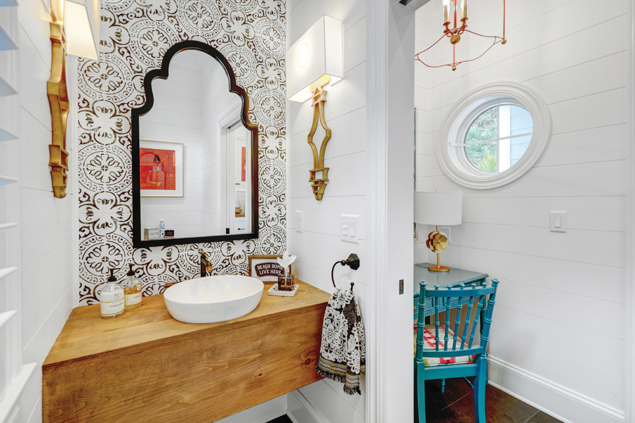
Carry over the colors: Cavan generally prefers small-to-medium-size patterns and mixing up checks with speckles or floral, and so on. “If you have multiple colors, be sure to pull in those colors in another area,” she advises. “So, if you have an accent pillow or fabric for the chairs that has pink, green, gold and blue, incorporate those colors throughout the room in some other way. And, I find, if you have a pattern and are missing out on a color in the fabric, the color could be through a bead, trim or piping on pillows.”
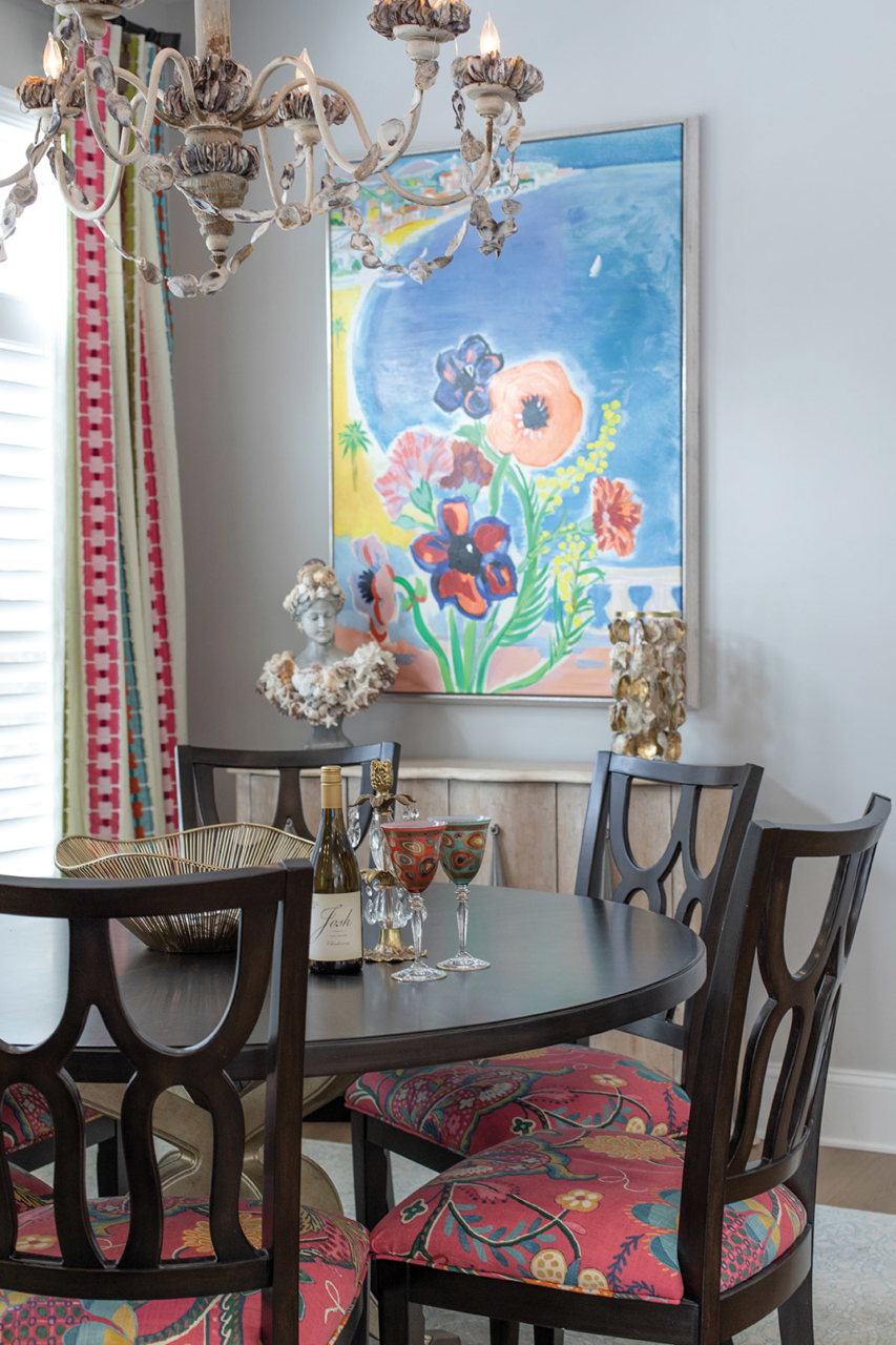
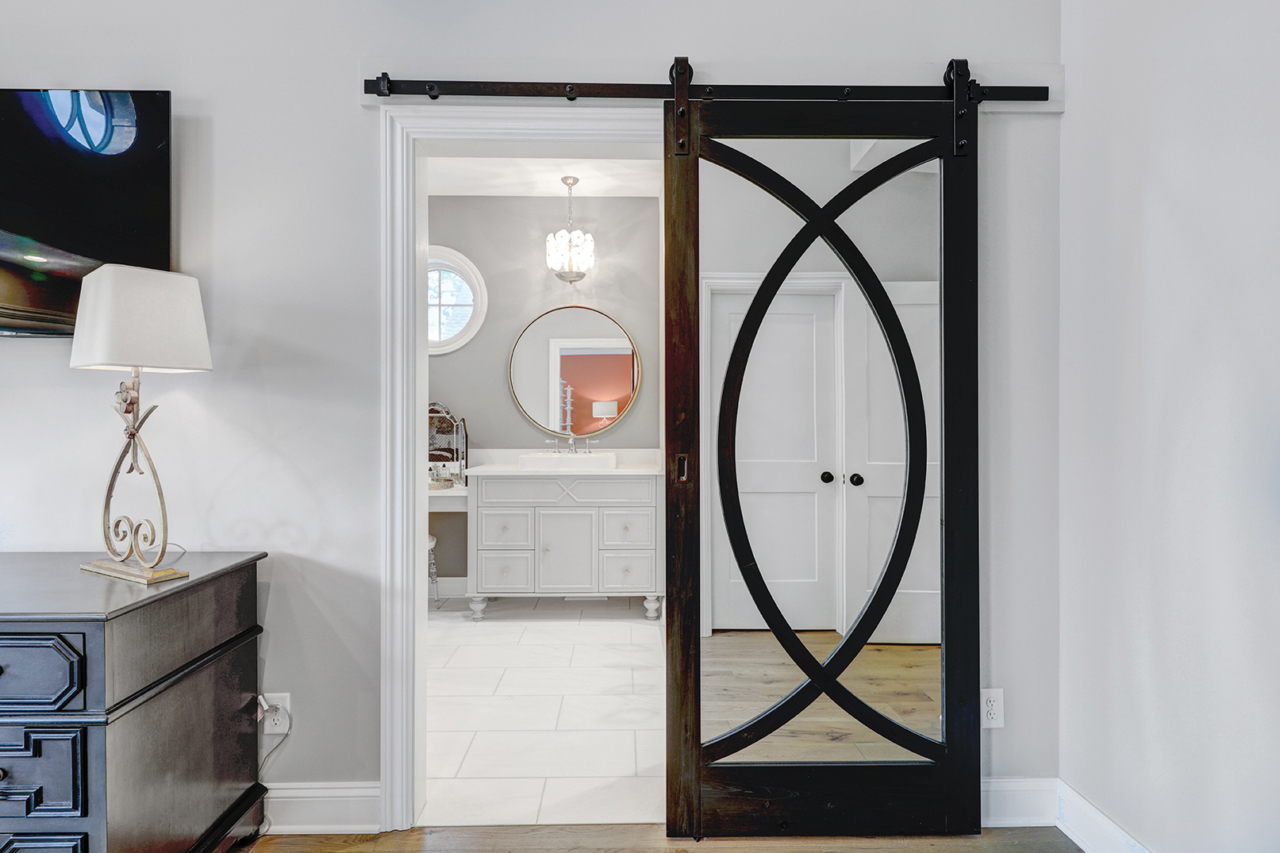
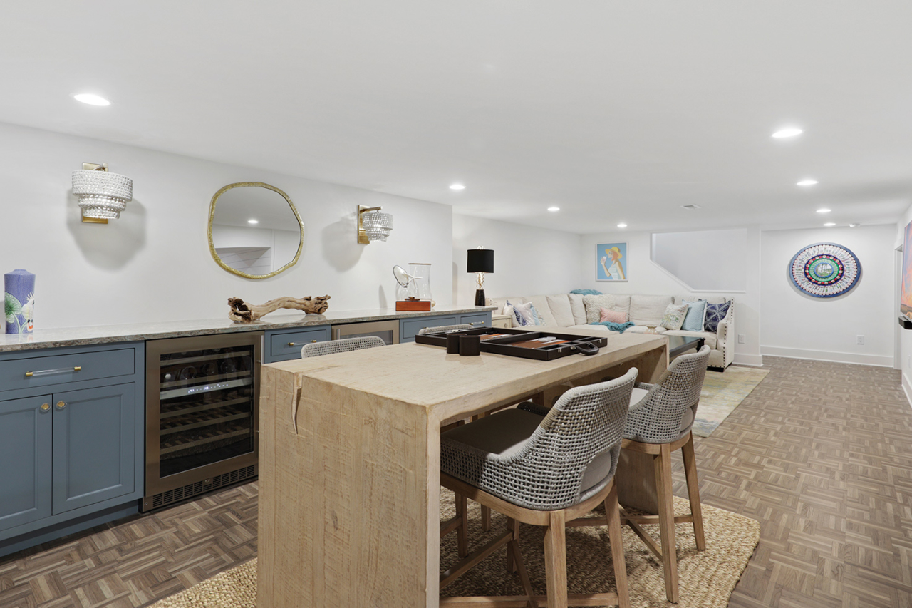
Ground the room: “You should have something black in every room to ground it,” Cavan says, adding that “every choice is intentional.” For instance, the black dining table and chair bases frame the floral seat covers.
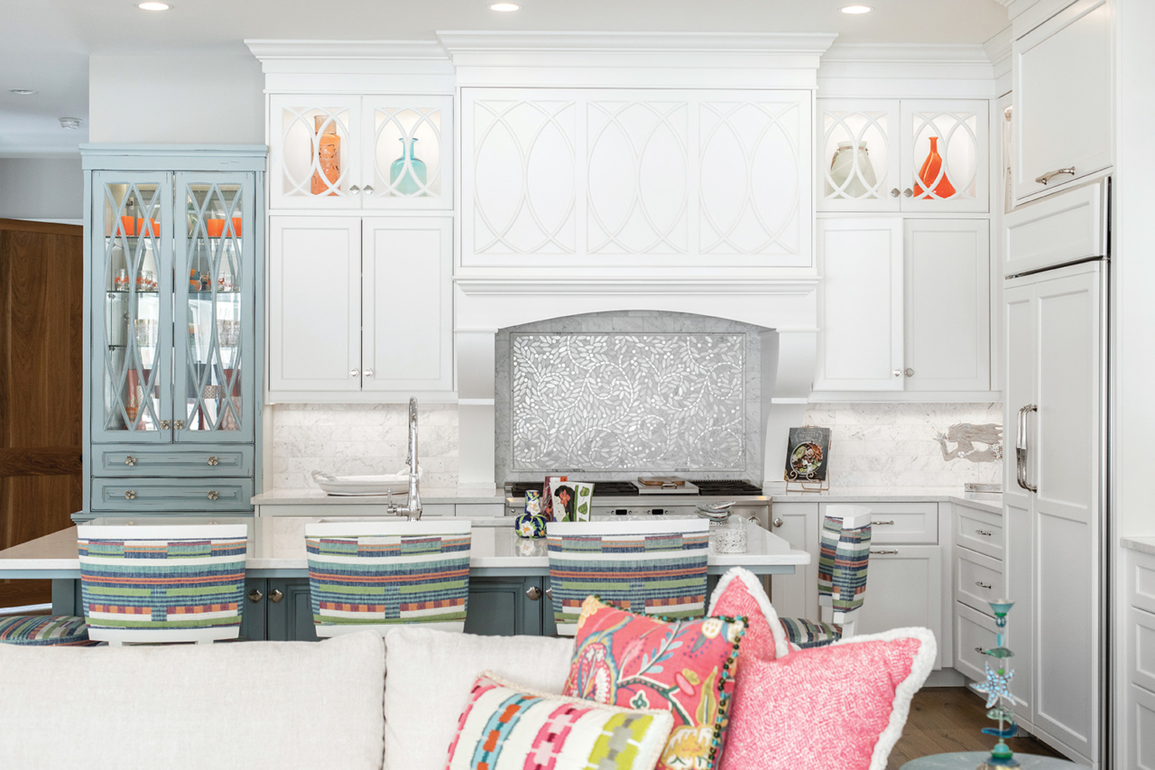
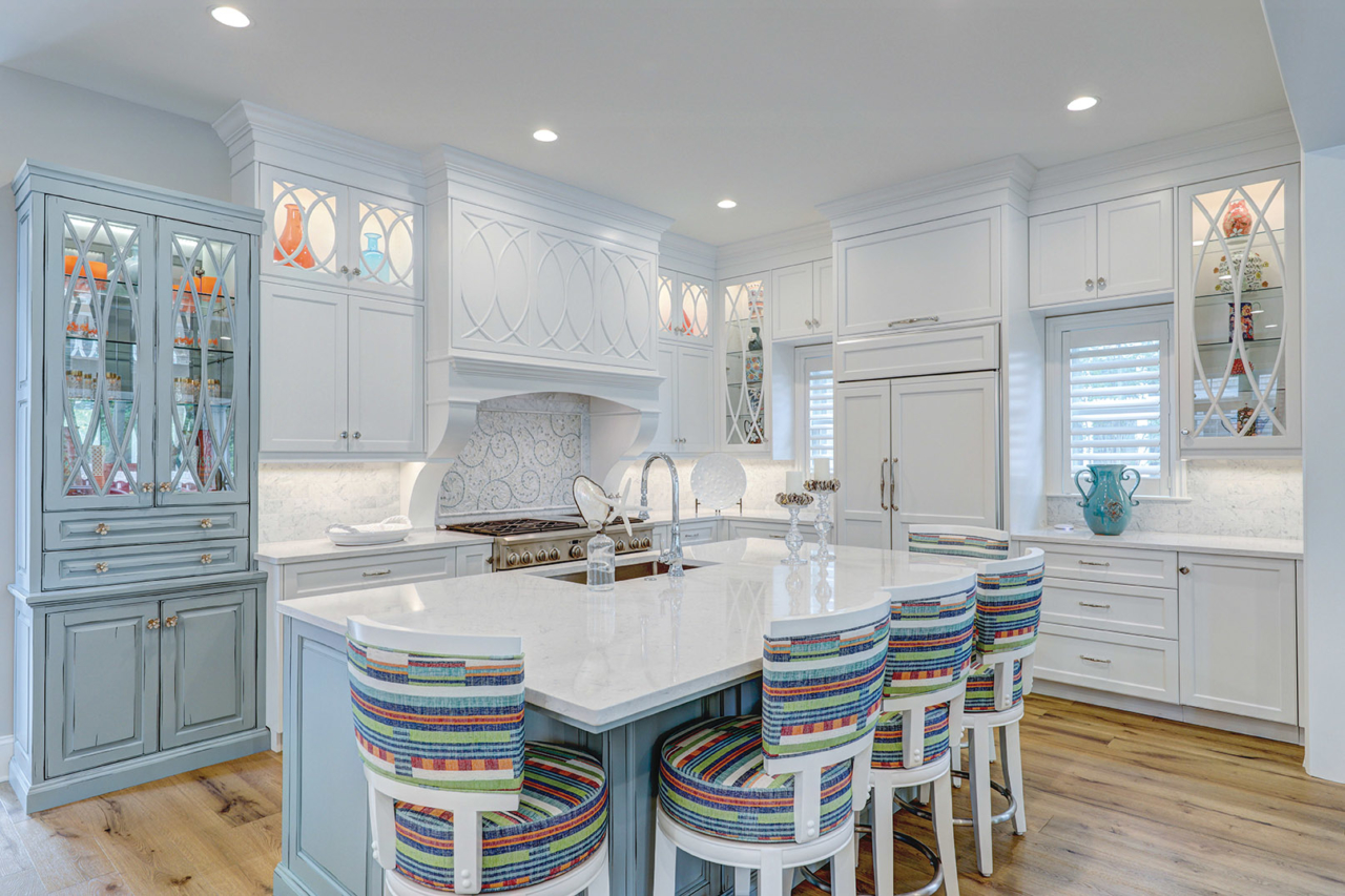
Coordinating complementary ‘pops’: Mixing metals into the color palette can add glitz — or sophistication. For instance, three barstools that tuck under the countertop of Lucite with gold match the cabinet handles. Gold-fleck detail in the countertop plays off these features.
Keep walls clean: “As much as I love color, if you have a colorful room, you don’t necessarily want to carry that over to your walls,” Cavan says. One of her top cool-neutral color picks is Sherwin Williams’ Repose Gray. For those who anticipate changing out pillows, rugs and artwork frequently, selecting a neutral wall that plays with warm and cool tones can save a repainting job. One example: Sherwin Williams’ Agreeable Gray, with its warm taupe-gray feel.
Select colors that ‘feel good’: “Even though there are no hard-and-fast rules for color, one is to use colors that make you feel good,” Cavan says, relating that she always asks potential clients about color preferences. What makes you feel great, energized — just happy? Which colors tend to drag you down? “As we have all learned since 2020, your home should be a respite, your sanctuary,” Cavan says. “Colors that work for one person might not work for another. It’s not about the color trends; it’s about the person in their home and how they feel in it.” CS